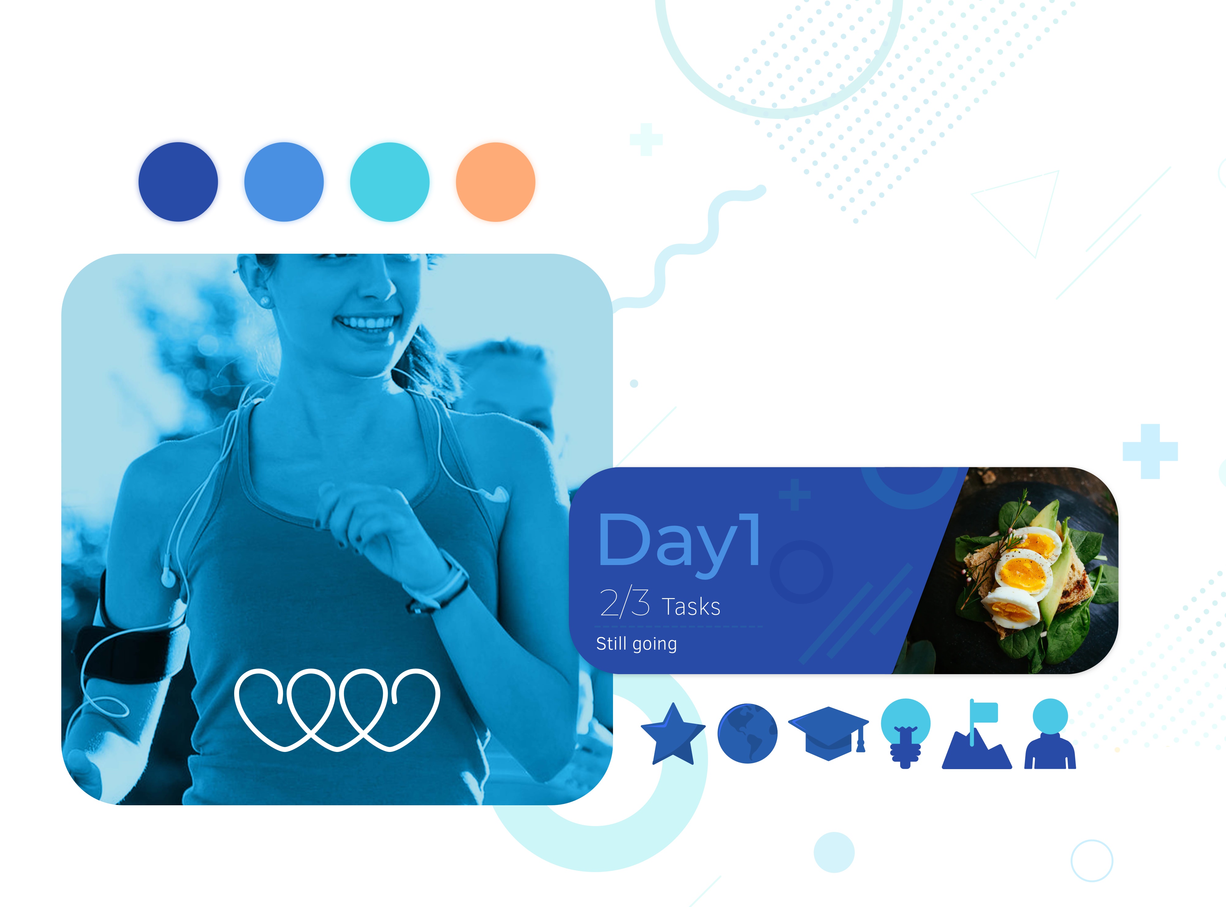
Vitachain Application
Research +  UX Design +  Prototype + UI Design

Vitachain application is an enterprise application that promotes a healthy way of living by introducing several health challenges for the users to undertake clinical trials in the future.

My Role

As a product designer, I was responsible for converting academic research into a joyful challenge for the end-user. I worked with the product manager, scientific researcher, and copywriter on a one-on-one basis.

Discovery and Exploration

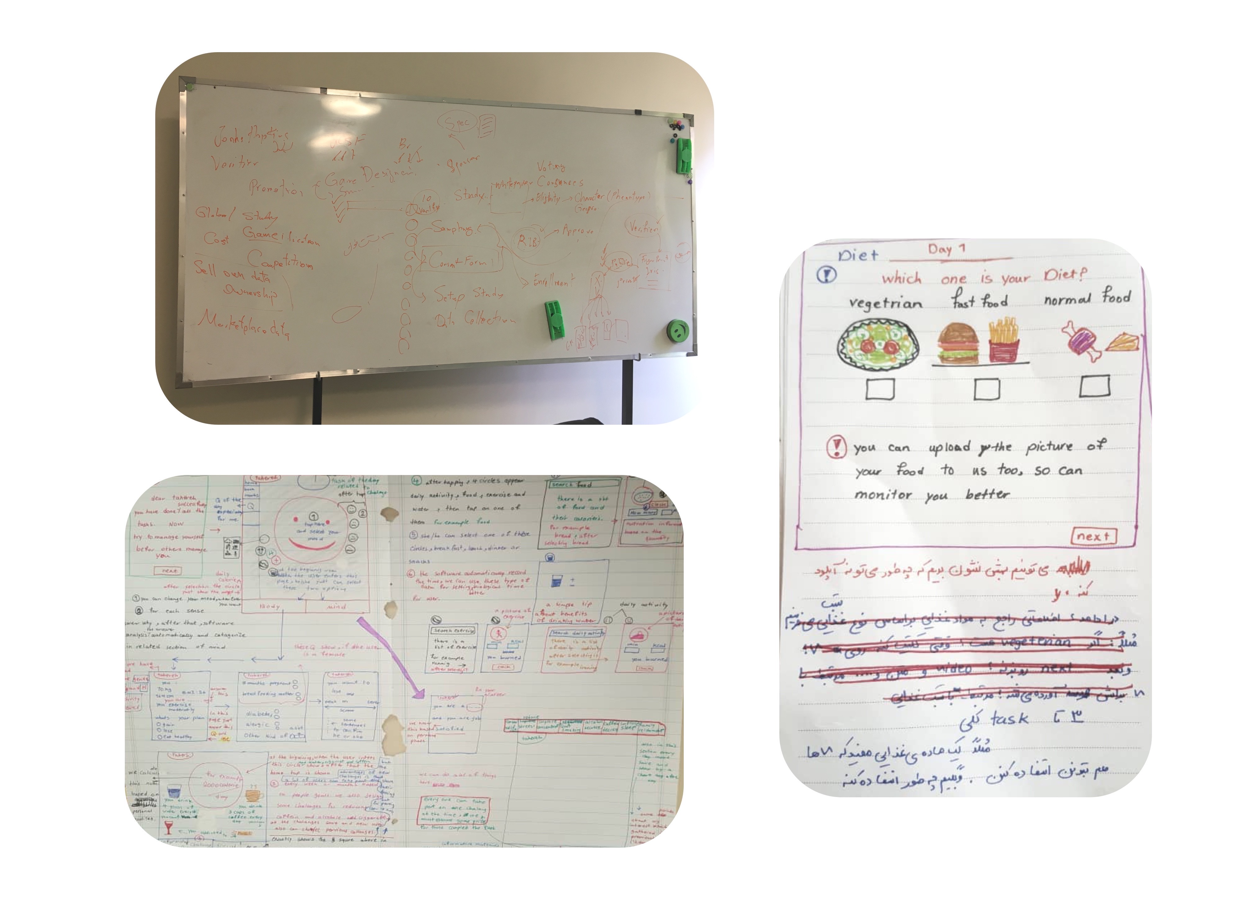
I led different ideation sessions with the team during the discovery phase and documented the requirements and constraints. ‌To suit business goals, we were supposed to provide a more personalized program for each user based on their health and activity data. Besides, engagement in the challenges was inevitable for our product.

Design Phase

I typically start with low-fidelity wireframes in the design process. This is how I quickly explore through a variety of design possibilities. A/B testing was one of the methods I used to find out which design performs better.

Challenge

One of the most complicated tasks was to find a solution to the dynamic challenges we were presenting to the user. Based on the information we gathered from each user, each challenge operated differently for them, and the task would change the shape to be more personalized. Furthermore, each challenge has its own set of tasks.

Solution

I broke down each activity into a graph of tasks. Each unique challenge may typically have multiple steps and various specific activities that must be completed. My suggestions for categorizing the activities for each challenge were Task Cards, Information Cards, and Question Cards. The cards could be displayed in a row in a varied sequence depending on the type of task. The following card will become available after you complete the current one. As a result, customizing each task based on the user's most recent data would be simple. On the other hand, unrevealed cards contributed to the feeling of playing a game and increased engagement.

Look and Feel

I designed the logo based on the attributes that work best for the brand identity.
Healthy + Balance + Linked + Lifestyle + Fresh
I chose a light chilly blue as the brand color since it has a fresh effect on the mind. The blue color, combined with the heart icon, symbolized a healthy way of life.

During the UI design phase, I tried to boost the brand identity by adding some tint bluish abstract patterns which users could feel the playful spirit of the challenges.