Hidee Application
Research + UX Design + UI Design + IllustrationHidee is my most recent application design on the market. It was created in response to our concerns about privacy on social media. Hidee is a tool for redacting important data from the image by the use of AI.
My Role
I was responsible for creating the UX design, use case scenarios, the user flow, UI design, and illustrations. I worked directly with the developer on this independent project.
Problem
Sharing sensitive documents online could expose people to the risk of being a victim of fraud.
Research
We needed to explore the user habits of sharing documents and which platform they use the most. Our research shows that people who are aware of the fraud, prefer to use some image editors to redact the data manually instead of free online services. We needed to reassure users that we wouldn't have access to their data if they uploaded their images to our service.
Design
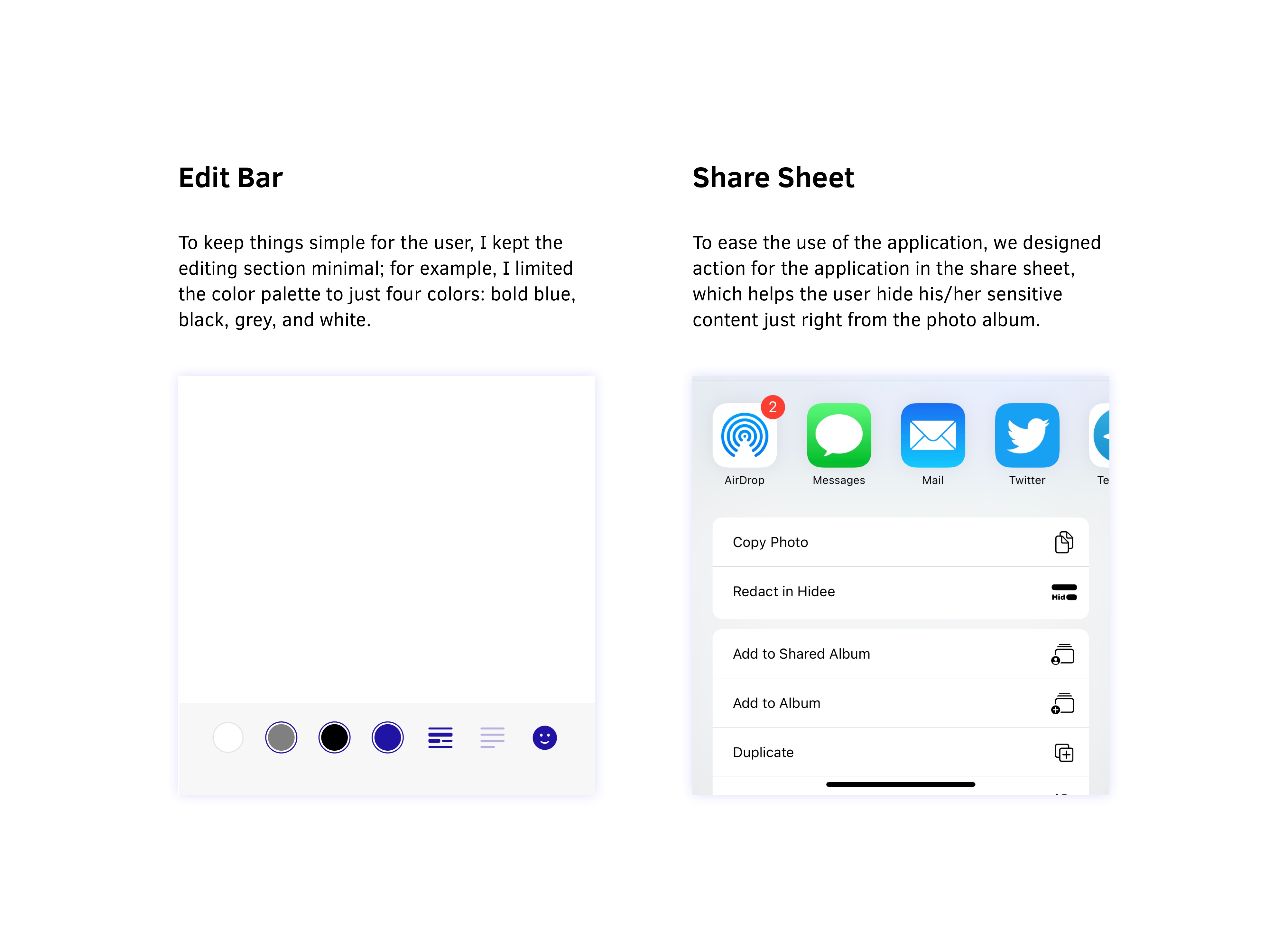
The interaction between the user and the app after uploading the document was the app's one and only crucial part. First, the application begins by recognizing words, and then the editor will appear for the user. The problem was figuring out how to tell the difference between the parts that the user wanted to redact and those that he didn't. Each word has a 60% opacity line over it, allowing the user to select it for redaction. After selecting the word, it will have a 90% opacity, allowing the user to read behind the redacted word to ensure that it is the one he/she wants. I also added two buttons to select or deselect all as a tool to speed up the redacting process.
Look and Feel
The word "redaction" brings to mind of black marker scribbled over text. To make the logo feel more intimate, I used handwritten marker lines to blackout a part of the typography. This half-revealed part helps the user to know what to expect from the app.
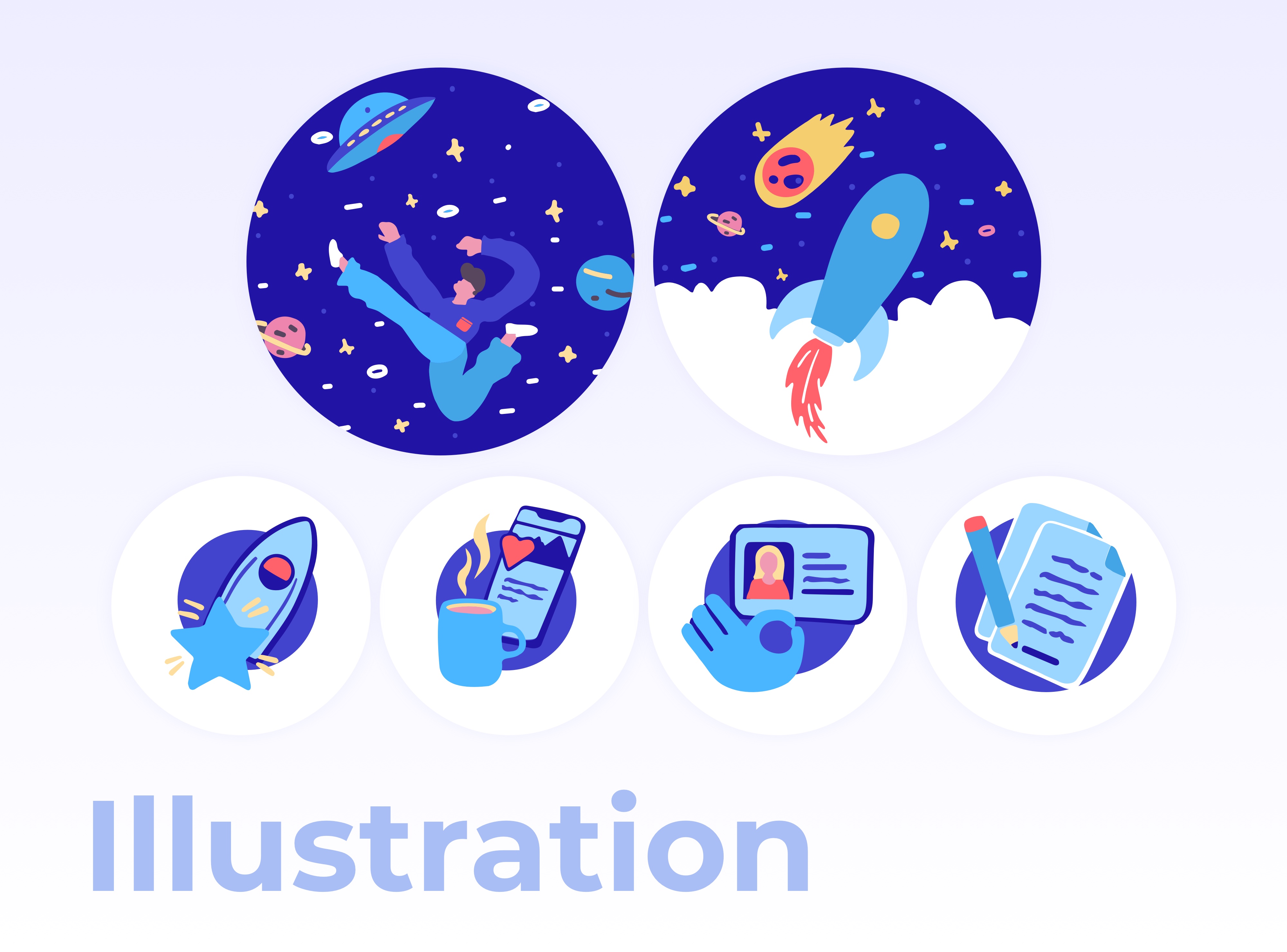
To stand out, I used a bright and bold blue. When a user shares his/her redacted image on social media with bold blue, it helps the brand to get noticed. Also, all of the illustrations have been created in a hand-drawn style to match the logo concept. I follow specific rules in drawing illustrations, such as controlling the volume of colors and the way each part has intersected. As the app has been designed for dark mode, I used another color palette for dark mode.